OCA – Digital Photographic Practice
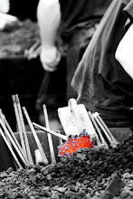
Project 3: Processing the image – Exercise 14: Interpretative Processing
The purpose of this exercise was to choose an image which was open to different kinds of interpretations. Using processing software, create three different versions of the same image.
I selected an image from my database from 2011.
A Nikon D300 camera, with a 50mm Nikon lens was used.
Photograph 1 - Original RAW

Photograph 2 - Completed Colour

Photograph 3 – Completed Rust Template

Photograph 4 – Black & White

By originally taking these photographs in raw, it has provided me with the opportunity to change many different factors within the processing stage. I decided to not make too many changes to the colour version, which I believe is brighter and more tonal.
The Rust Template was a standard template I have on Lightroom and I’m not sure this worked. It highlighted the eyes and face details, but lost any naturally feeling with the colours produced. The black and white version was a standard conversion and even though I prefer black and white, on this occasion I do not believe it worked. I prefer the colour version.
OCA – Digital Photographic Practice
Project 3: Processing the image – Exercise 15: Black & White
The purpose of this exercise was to take an image in colour which I thought would be more suited to black and white after processing.
I selected an image from my database from 2011.
A Nikon D300 camera, with a 150mm-500mm Sigma lens was used.
Photograph 1 - Original Colour

Photograph 2 – Processed Black & White

By originally taking these photographs in raw, it has provided me with the opportunity to change the required processes more easily.
The photograph was taken at Woburn Safari Park and I knew when I looked at the Rhino that the texture of its skin and the lighting would be better suited to a black and white image.
I used Lightroom to make the adjustments and I wanted to highlight the texture and tones in more detail, which I believe has succeeded.
I much prefer the black and white version on this occasion and I feel the image comes across as more dramatic.
OCA – Digital Photographic Practice
Project 3: Processing the image – Exercise 16: Strength of Interpretation
The purpose of this exercise was to find out if you can be much more aggressive with changes to an image in black and white, rather than in colour. I used the contrast tool and brightness range whilst processing, which gave the following results.
I selected the following images from my database from 2011.
A Nikon D300 camera and Nikon 18-200mm lens were used.
Photograph 1 – Original Colour

Photograph 1 – Strong Contrast Colour

Photograph 1 – Brightness 100 Colour

You can see how the contrasted image has lost detail within the darker areas and that the brightness image has been completed washed out, in particular within the sky and roof details on the train.
Photograph 1 – Black & White

Photograph 1 – Strong Contrast Black & White

Photograph 1 – Brightness 100 Black & White

The details within the contrast image in black and white have kept more data visible within the image. The black and white brightness image did not turn out as good as I expected, but it still has a better effect to the eye than the colour version in my opinion.
I tried this with another set of images and using the exact templates as on the images above provided similar results. When adding an element of selection to the contrast and brightness amounts used, the black and white images provided a much improved result.